Redfin's Housing Market Interactive Map (Home Price Drops EXPLODE)
32,249 View

- Publish Date:
- April 4, 2023
- Category:
- Real Estate Trends
- Video License
- Standard License
- Imported From:
- Youtube

#housingmarket #realestate #housingcrash
Want access to the maps and charts I use in these videos? You can get full access here: https://app.snapforce.com/prodigy/checkout.php
Looking for your next deal? Want to find foreclosure's and pre-foreclosures? https://www.foreclosure.com/?rsp=3626
New Twitter: https://twitter.com/realRJTalks
Redfin's Housing Market Interactive Map (Home Price Drops EXPLODE)
The 2023 housing crash continues to play out, we do a deep dive analysis on some of the housing market's with the largest price drops thus far, including metro's that are regularly requested. We analyze the peak to trough house price's using the new data feed from Redfin, on an interactive map to show the largest price drops vs the smallest.
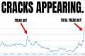
We also explain the newly updated Freddie Mac House Price Index that now has the US housing market with only 1.1% year over year price growth. Which means over the next 1 to 2 months we should see national house prices dip negative year over year. We also give you the FMHPI on top of the S&P case shiller index to make it clear just how reliable this index really is.
If you are a home buyer, home seller, or real estate investor, this video is a must watch to stay in the know about the latest housing market information as well as where you can expect home prices to trend over the next 6 to 12 months.
This video is not financial advice.